Tuesday, November 30, 2010

Keeping the Kiddies Occupied—Vintage Style

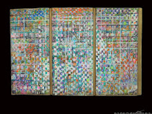
This "game" dates to the mid 1920s. The A.C. Gilbert Company was located in New Haven, about 15 miles from our home in Guilford, and would become famous world-wide for its chemistry sets and Erector sets later in the century. The object of this game was to create artistic patterns using a cardboard holder punched with holes, with hundreds of very small shiny metal "marbles" you inserted into the holes using patterned diagrams. I have a feeling Hoohoo rarely, if ever, used the patterns, creative little girl that she was! The cover art is wonderfully evocative of the 1920s, isn't it?

My Addam's Family game is dated 1965, the year after the hit TV show first aired. I've lost the directions, but remember that somehow you needed to collect the various categories of cards, Gomez, Morticia, the Children, etc.

This is a toy I picked up at a tag sale in the early 1980s, and seems to be from the early 1960s. There is a very colorful pressed tin layout, illustrated on the front of the box, and the separate tin train, above, is wound with the key and motors its way around the track. I'm not quite sure where the "magic" comes in, the train only goes in one direction, but it still works perfectly. I really like vintage tin toys, and have quite a few.  

N O T E :  This makes my 75th post for November, a nice number to end on. I'm going to take the entire rest of the month off now, lol. See you tomorrow!

LIFE Magazine—February 6, 1956

It Was the Best of Times, It Was the Worst of Times

The cover of this mid-Fifties Life magazine shows Shirley Jones, star of the then-new movie, Carousel. Shirley not only played David Cassidy's mother in the Partridge Family TV show, she was his real-life step mother, having married Jack Cassidy in 1956. Interestingly, the wear-and-tear of this almost 55 year old magazine, shows that an extra layer of magenta-ink/varnish was used to make this image even more "sugary" sweet and warm. Notice the edges where the darker overlying inks have worn away, revealing the extra layer of magenta. This issue is dated February 6th, 1956, which was my grandmother's 61st birthday, and approximately 15 months before I graced the Earth with my presence, lol.

Who knew that CBS, The Columbia Broadcasting System, had a division that built TVs in the Fifties? I remember the days when picking out a new TV meant having a choice of actual wooden cabinetry. We had some absolutely beautiful television sets when I was growing up. Even our stereo was in a huge wooden cabinet, and included a record player and AM/FM/Weather Band radios, and storage space for the records. It must have been six feet long and 2 feet wide, a very real piece of furniture that needed to be taken into account in the design/decoration of the livingroom. Notice the pretty white women used to sell these American television sets. Reality and diversity had not begun to make much-needed inroads into the advertising world yet. More on this Fifties reality below.

OK. Whatever happened to this wall refrigerator and freezer? Apparently GE designed this unit to take the place of eye-level kitchen cabinets. I've never seen one in person, and have never even seen an ad for one until I came across this one. I'm fascinated by the concept! How very Mid-Century Modern to build the refrigerator into the space instead of having it just standing up taking space.

This is an ad for General Motors, not just Chevrolet, touting the corporation's new four-door pillarless bodystyle. This Bel-Air Sports Sedan's Sierra Gold/Adobe Beige two-tone color combination, was one of Chevy's most popular, and can be seen today at almost any car show featuring Tri-Five Chevys, the nickname for the '55-'57 generation of Chevys.

Way before one of my favorite James Bond movies was filmed, Diamonds Are Forever, there was this ad for "A Diamond is Forever." Featuring the Love Letter, painted for the De Beers Collection by Herbert Saslow, the actual shiny gems are relegated to the bottom left, and appear almost as an afterthought. The diamond shapes in the painting are wonderful, the sentiment is lovely, and I can't help but think this would never be approved today. The product must always be front and center, lest the message be lost on America's less-than-brilliant general population. I know, snarky, but the dumbing down of America is just about complete in my opinion. If a message isn't immediately understood by someone with a 5th grade reading comprehension level, it's no good today.

It wouldn't really be an artandcolour post without a Lincoln in it somewhere, right? Except, this phenomenally gorgeous Continental Mark II isn't technically a Lincoln at all. For this limited production, ultra luxury coupe, FoMoCo added an entire division, the Continental Division, to its corporate stable. The 4-pointed star logo was created for this Continental. A short couple of years later, the division was folded into the Lincoln-Mercury family, and by '61 would be selling the classic suicide door Lincoln Continental sedan.

And Think of Mother! That's the text in this ad for Bendix's new electric clothes dryer. I mean, my gosh, hanging the clothes in the basement means Dad and Sonny-boy are terribly inconvenienced in their quest for All-American recreation activities. The two-color layout is very eye-catching though, as well as less expensive than a four-color ad, no matter how sexist the marketing statement was.

This ad for the '56 Oldsmobile 4 door pillarless hardtop, a Holiday in Olds-speak, has wonderful typography. The horizontally-scaled type for "The Car with the Power Personality" works beautifully with the rocket flying through it, and the wonderfully vertically-scaled "88" is a perfect way to lead your eye to the paragraph of text on the far right.  These were the years of the Rocket 88s, and the space-age theme was repeated on the engine, the dashboard, the corporate logos on the hood and steering wheel, and would prove to be a long-lasting Oldsmobile theme, right on through to the 1970s.

Now lest we start to get all warm and fuzzy with these "wonderful" glimpses at American life in the 1950s, LIFE also had this story on the "South Rises Again" in a campaign to delay integration. Notice all of the middle-aged white men from all walks of their limited lives. In the top photo which goes across the spread, there is a lawyer, a farmer, a couple of U.S. Congressmen, two teachers, three U.S. Senators, an insurance executive, and a state representative. Governors of the southern states are represented in the lower photos, There is a photo of a Pontiac Catalina coupe with "anti-negro" slogans all over it, carrying segrationists from Nashville.

The story runs six pages, and includes a photo of a closing prayer at a citizen's council meeting in Jackson, Mississippi. The Presbyterian minister Albert Sydney Johnson, named for a Confederate general, gave the Benediction. A President-Emeritus of Bellhaven College declared: "Segregation is not a child of race prejudice . . . segregation can be defended because it is the only reasonable and practical means to prevent racial intermarriage." Yes, "racial intermarriage" was a large part of their racism. I'm sure cries of "this will ruin the sanctity of marriage" were heard throughout the cracker South. As incredibly hard as it is to believe, it was not legal in all fifty United States for blacks and whites to marry until 1967, with the Supreme Court case, Loving v. Virginia making it a Federal law (ironic court case name, right?). Something tells me with the radical right-wing Roberts Supreme Court of today, they would find a way to decide the case differently.

Sound familiar to anyone today? Today's Focus on the Family, Family Research Council, Concerned Women for America, and other homophobic hate groups exist only to "prevent the ruin of the sanctity of marriage" but today they rail against gays instead of blacks. At least today we have the internet and we have civil rights attorneys around the world working on our behalf. And we have the Southern Poverty Law Center calling out these hate groups for what they really are.

Early 20th Century Miami Beach Postcard

Is There Even One Square Inch of Deserted Beach in Miami Today?

This undated vintage postcard of Miami Beach shows a beautiful, undeveloped stretch of tropical Miami Beach. The windblown palm tree and the whitecaps in the water, speak of a blustery Miami winter day, or perhaps a gathering storm. The black-and-white image illustrates just how much can be done with the photographer's eye while not resorting to the retina-searing bright colors used on postcards today. This example was found in a trunk of items belonging to my great-aunt Edith who died in the early 1920s after contracting the Spanish Flu in 1919 and never fully recovering. I'd guess this is from the 1900-1910 period.

On the back of the postcard in the upper right corner, is this stamp placeholder. I've googled for an hour trying to figure out what the "A Z O" surrounding the "Place Stamp Here" type means, but to no avail. Any ideas?

U P D A T E :  Loyal reader Annie has solved my newest mystery! The AZO is a paper mark, which now can be used to date unpostmarked cards like this. According to the listing, AZO with two triangles pointing up and two pointing down, date this card to the 1918-1930 period. Now I'm guessing that my grandfather might have purchased this for his sister. He was in boot camp in Georgia during 1918, and could have bought the card at that time. Here's the site Annie found. Bookmarked and added to my "Reference" list.

This One MUST Be Worth $Millions : )

Millions of laughs, maybe. This David Cassidy comic book is dated 1973. While I certainly sported the hairdo, I wasn't a fan of his, and didn't watch the Partridge Family TV show very often. I really have no idea how this comic came into my possession. Many of the "newer" comics I have yet to scan for this blog—Archie comics, Fantastic Four, Batman, Little Lotta and the like—have little pieces of masking tape with prices marked on them, a dime or a nickel or a quarter. I think I might have once bought a box of comics at a tag sale, or perhaps my parents did. They went "bargain-hunting" every couple of weekends, garage sales, thrift stores, etc, and occasionally came home with some mighty strange items, lol. The psychedelic styling of this comic book, the typeface and ink colors, is tame and sugary, but it's still a cool kitschy item from the early Seventies, totally in keeping with its teeny-bopper theme.

Interestingly, David drove a bright red Triumph TR6 in this comic book, pictured above. I have no idea if that's what he drove on TV, or if he drove at all. What kind of a name is Letty, anyway?

Monday, November 29, 2010

Classics Illustrated: Early PIctorial Cliff's Notes?

Among my collections of, well, almost everything, are these early "graphic novels," Classics Illustrated. They are abridged versions of books by well-known authors such as Alexandre Dumas, Robert Louis Stevenson, Victor Hugo, Jules Verne, H.G.Wells, Nathaniel Hawthorne, James Fenimore Cooper, and Winston Churchill. There is even a Shakespeare play, Macbeth, and Homer's epic poem Iliad! Macbeth is in the bard's own words, but must be pretty edited, as all of these "comics" are 48 pages and of course, heavily illustrated. Included in the group above, top left, is Issue No.1, The Three Musketeers.

The copyrights on these issues date from 1943 through 1948, but oddly enough, they might actually date "only" to the early 1950s. In doing some research on them, it seems that since they are only 48 pages, have painted covers (as opposed to colorized line drawings) and have  a cover price of 15 cents, these are all technically reprints. I don't understand why the copyright pages don't reflect the reprint data, there is no mention of a second/third printing; nothing but the original copyright date. Perhaps the information I sourced online is wrong, but I found the same information on two different sites. 

My collection numbers forty, out of 167 titled issues, and I have both No.1 (mentioned above) and the final title, No. 167, Faust by Johann Wolfgang von Goethe. I visited Goethe's birthplace in Frankfurt, Germany in 1975, once again illustrating my multiple connections to my multiple collections, lol.

• For the Wiki on these Classic Illustrateds, click here.
• For the first post of my vintage comic books, click here.

In the first row above, notice both issues are labeled No. 52. Jules Verne's The First Men on the Moon was actually published in London, instead of New York, and printed in Sweden. The trim size is slightly smaller as well. I'm not positive, but I think my Dad probably bought these magazines at PXs around the world, while he was in the Navy, which would account for the european publisher. 

Bottom right in this last group, is Shakespeare's Macbeth, and The Crisis, by Winston Churchill—in a comic book, lol!

Update: For my loyal reader, AP, who commented that With Fire and Sword by Henryk Sienkeiwicz was his favorite Classics Illustrated. I just happened to have a copy!

1981 Mark VI—Red Hot Chili Pepper Edition?

. . . or perhaps Mercury's former top-shelf Comet, the Caliente, was making a comeback as a Lincoln? 

M Y   C O L L E C T I O N — My last crop of little red chili peppers is drying nicely. I thought about stringing them together, they make very cool looking garlands for the kitchen, but I'm having fun setting them up in photoshoots. Here they are accessorizing my 1981 Lincoln Continental Mark VI dealer brochure. The satin gold cover, and the trés elegant typesetting really harmonize with the deep red peppers for an unexpectedly "holiday" appearance, wouldn't you agree?

This series of Marks came with several designer editions, which I've photographed below. Generally, the designer packages were paint and trim combinations with no specific mechanical for performance changes from the standard Mark. Although the Red Hot Chili Peppers wouldn't form in L.A. until 1983, I think a Mark VI designer interior made from tube socks would have been perfect for them...

I absolutely love the style of the illustrations and the layouts used in this brochure for these designer Marks. The rest of this booklet uses "regular" photography. By employing these artistic renderings, the concept of the fashion designer influence is really emphasized. This is a really well-done square brochure, 11 1/4 inches x 11 1/4 inches. When it's opened, the spreads are deliciously large!

The outline font used for this cover is extraordinarily tasteful and well-done. The kerning, or inter-character spacing, is spot on, with the very slight exception of the A-L connection in the word Continental. I'm not sure why the designer felt the need to add the teeny tiny dividing line. The rest of the cover has nicely connected letters when necessary, and that A-L could certainly have done without the divider. Yes, I'm a typesetting NUT as y'all know, lol. 


All photos are clickable thumbnails so you can see these illustrations in greater detail.

• For the Wiki on Lincoln's long history of their Mark series, click here.

The Hubert de Givenchy edition came in Black and Dark Pewter Tu-Tone (Ford's spelling, not mine), with a Black landau vinyl roof and wire-spoke aluminum wheels. The interior could be had with cloth or leather, both in Pewter. This generation of Lincolns, both the Town Car/Coupe and the Mark series, were greatly downsized from previous years losing almost a foot in length and close to 1,000 lbs in overall weight. By continuing these "ultra luxury" special editions, Lincoln was stressing that the luxury factor had not been downsized in the least. 

The Emilio Pucci edition came in a subtle tone-one-tone, in Medium Fawn Metallic with a Light Fawn bodyside molding and a full vinyl roof in Fawn. Wheels were the wire-spoke aluminums also used on the Givenchy edition. The interior was furnished in Light Fawn leather with a Tu-Tone Light and Medium Fawn leather-wrapped steering wheel. I think the full vinyl roof treatment he chose was really tasteful. Many luxury cars, Lincoln included, had the option of a half- or Landau roof treatment, which I always found to be a bit tacky. I owned an '85 Town Car for nine years, and I had to choose a base-level Lincoln sedan to get a full vinyl roof instead of the Landau version. The dealer offered me a great deal to get the more expensive Landau roof, but I just couldn't look at it every day, lol.

The Cartier edition came only in Pewter, inside and out. The Landau roof was Medium Pewter, while the paint was Medium Pewter Metallic. A thin Dark Red coach stripe on the body and decklid was the only relief from the gray. The wheels were the Lacy Spoke cast aluminums offered optionally on other Lincolns.

Finally, Bill Blass really went to town with his nautical-inspired Mark coupe. The exterior was Dark Blue Metallic over Light Fawn Metallic, and the roof used an exclusive Cloth Carriage roof—a simulated convertible treatment. Earlier Blass Continentals were offered in White and Navy Blue. I think this Fawn and Navy Blue softened the look and "classed" it up a bit. The interior, available in cloth or leather, was also in a Tu-Tone Blue and Fawn combination. The wheels were the cast aluminum lacy spoke versions, which I also had on my Town Car. All Designer Edition Marks came with a personalized instrument panel nameplate for the buyers of these luxury cars. I like this Blass edition—I think the Tu-Tone paint treatment really made these newly-shortened cars look as long and as sleek as possible.

This generation of Marks, 1980-83 included the only four-door sedan in its rich history. Illustrated here is the Signature Series, the upper level of Mark sedans and coupes. The Signature Series, in 1981, was only available in this gorgeous Dark Red Metallic or Silver Metallic, both with color-keyed Landau vinyl roof and bumper rub strips, with matching interiors. This would be the last Mark series to utilize the inset oval opera windows, a look begun by the '72 Mark IV. Starting in '84, with the Mark VII, Lincoln reverted to a coupe-only lineup, the beautiful aero-styled Mark VII. The Mark VII stressed performance as a luxury feature, even including a specific model, the LSC for Lincoln Sport Coupe. The era of the "Hot Rod Lincoln" had begun.

Sunday, November 28, 2010

Talk About Artandcolour! 1972 Mazda Catalogs

Mazda's 1972 catalogs were inspired by the Pop Art of the day, and in today's light, are really evocative of that psychodelic period. The general catalog is to the left, including the "larger" RX-2, and one specifically for the smaller RX-3/808 models, is on the right, The RX- designation denoted the Rotary powered versions. The RX-3 also came as the 808, a lower-priced, higher economy piston-powered version. Aren't these covers fantastic?

The catalogs open with a spread touting its rotary engine, manufactured by Mazda under license from Germany's NSU/Wankel—which would be bought by Audi—which was then bought by VW. The forecast that by "1980 85% of all cars would be Rotary-powered," would prove to be a bit optimisitic, lol. After developing their own rotary engines for years, both GM and Mercedes Benz gave up in the mid 1970s, never overcoming their thirst for fuel in those days of OPEC-sponsored gas shortages. Mazda is still the only company offering a rotary engine, and only in one sports car, the RX-8.

Not much to look at, the RX-2 was the darling of car enthusiast magazines of the day. They were well built, well equipped, light weight, and powerful beyond their class. They were raced by Car and Driver in their magazine sponsored Reader-Challenges in the early 1970s. I attended one of those with my parents at Lime Rock in 1973. I still have a bumpersticker giveaway, and an issue of their magazine with a special sticker on it, but can't put my fingers on them right now. The cover was GM's new-for-'73 Oldsmobile Cutlass in its new colonnade coupe guise.

The RX-3 was the smaller and less expensive rotary-powered line. Again, not a looker by any stretch of the imagination, really not much more than the fussy generic Japanese lines of the day, and they weren't economical on gas at all, but they were sweet little high-revving sports sedans. I haven't seen one in years and years. I wonder if anyone has restored one?

• For the Wiki on the RX-2, click here.
• For the Wiki on the RX-3, click here.
• A cool remembrance of early '70s imported sports coupes, including the RX-3, at this blogsite.

First Purple of the Winter

After almost six months of dormancy, my african violets are beginning to bloom again. I have six violets planted together in one large pot; this is the second variety to flower, a pink version flowering last month. I have buds on three others right now. I lost one of these violets last summer, but another one divided shooting off a baby, so I still have the same number. These plants constantly try to get out of their pot, growing outwards, and two of them are actually hanging down the side in a very cool way, almost like a large plant-like "brooch."

Ford 1975: The Other Side of the World

The cover of the 1975 German Ford Escort brochure, available in coupe, sedan and wagon bodystyles. This has become known as the Series II for this platform, the Series I being built from 1969-74. In '75 the car was restyled with more contemporary squared up lines. The wagon used the new front clip grafted onto its older, more rounded body—not an aesthetic triumph to say the least—but one that must have been rooted in economics. I think this updated body is very attractive, the rear wheel drive proportions clearly in evidence, and the thin pillars and low beltline are exactly to my taste.

I spent some time in Germany in the spring of '75, as part of an exchange program. I studied German for four years in high school, as well as French and Russian, but honestly, was never very good at foreign languages. My last attempt was a year of Intensive German in college, and then I decided to concentrate on studies I actually could progress in, lol. In the spring of '74 I had planned a Russian exchange, but at the last minute, literally the week before I was to leave, the Russian government cancelled all visas for a while. So I was really happy to go to Germany the next year.

The mid-level Escort L coupe. There was a base level underneath this, and a Ghia level above.

The wagon bodystyle utilized the rear body of the more rounded earlier Series I, which didn't really mate very well with the squared up front clip. "Basic" sure describes the rear space. I can't think of any American wagons from that time with plain painted metal for the load floor. If not carpeted, domestic wagons usually came with a linoleum-type floor covering in a matte finish.

The upmarket Ghia level of trim included this oh-so-American vinyl roof. The sedan's updated greenhouse looks great to my eyes. Comparable cars imported to the US at this time would have been the rear wheel-drive Plymouth Cricket and Mitsubishi Colt and the brand-new front wheel drive VW Rabbit.

The Escort Sport, with its rally-inspired driving lights and blackout trim.

• For the Wiki on this European rear-wheel drive Escort, click here.

Saturday, November 27, 2010

Ford's 1972 Better Idea Lineup

This is a large format dealer piece for the 1972 Fords, 18" x 11". I've only found this one folio, consisting of the front and back covers, featured here, and the inside covers featuring a page for the Pinto and a page for the Thunderbird. I have no doubt the rest of the interior pages fell out and are probably in another of my brochure cartons. I have 7-8 large cartons full of dealer literature, and will get around to totally organizing them at some point. I've scanned these two images large enough to be able to read and to enjoy the illustrations. This is an early promo piece, with a litho date of 8/71. The Pinto Wagon and Squire were introduced in February of '72, too late for this piece.

This is the year my dad bought a new LTD Brougham 2 door coupe in Light Gray Metallic with a black vinyl roof and a black interior, with the optional high-back "Twin Comfort Lounge" split front seats. My dad was 6'3" and my mom was 4'10" so they always tried to have either bucket seats or divided front seats like the LTD's. This is the car I drove to my high school proms, otherwise totally forgettable evenings for me, lol. 

• For the Wiki on the Pinto click here, Most of the information seems correct to me, except for the price. Wikis states it was "close to $1,850" but I remember distinctly it was $1,919 for the 2 door base coupe.

Umm, Not Sure What This Is... Dated 1931

Front, top and back of this approximately 5 1/2 x 3 inch piece of paper. The weight of the paper is akin to tissue paper, it's incredibly thin. I found it in one of my antique books. The date on this paper is 1931, and it appears to be a receipt of sorts for a charity. The Army & Navy Veterans in Canada, Quebec Unit No. 33 is printed on it, and it seems to be $1.00 subscription fee for a million dollar charity... A Google search didn't turn up anything germane. The name signed on it is my great-uncle Arthur, a very interesting man that died when I was 6. He was an inventor of sorts, a collector of wildflowers which he pressed in many books and notebooks, and the proprietor of the small beach store on the family property, opened in the middle of the Depression in the early 1930s. This piece also has "Derby-Epsom-England" printed on it and a specific date of June 3rd, 1931. Perhaps it was some sort of Lottery ticket? I like the typography and the art on it, so I scanned it. Plus, I'm surprised such a thin and delicate piece of paper could still be around almost 80 years after it was printed. Any ideas? Clickable to reading size.

"Uncle" Tom McCahill on 1959 Chevy Rear Deck: "What a Spot to Land a Piper Cub On"

The November 1958 issue of Mechanix Illustrated previewed the new '59 cars, and their famous "Father of the Road Test" Tom McCahill tested the "batwing" Impala Sport Sedan. The cover features a glued-on piece touting this road test, almost an early Post-It. I carefully folded it back to show [almost] the entire cover. MI was printed on low-end paper stock, just a step above newsprint. It has yellowed and is much more brittle than usual magazine stock. For that reason, I had to be careful not to split the binding when I scanned the pages, so they're not as flat and as well-scanned as I usually try to show on my blog. This magazine is truly from another era though, so I think it's a good idea to post them anyway.

The first two spreads of the Impala roadtest. Tom McCahill was known for his very colorful writing style, using out-of-this-world hyperbole, double entendres and puns whenever possible. Layout-wise, this article broke one of MY cardinal sins in publishing. The story jumped from these first 4 pages, which is fine with longer pieces, but it was jumped to four separate pages in the back of the book: a paragraph here, a paragraph there. 

When I was laying out newspapers, I insisted that once a story "jumped" to a continuation page, it ended on that page. In any article, you're lucky if the writing is interesting enough to jump the first time. If you force your reader to jump to 4 more pages, especially with just an additional paragraph on each jump page, I can almost guarantee 99% of readers won't finish reading. Of course, McCahill was colorful enough to MAYBE get the reader to the end, but I wouldn't count on it.

Elsewhere in this issue, the '59 new cars were previewed:

• For the Wiki on 1959, including births/deaths, Academy Awards, Nobel Prizes.
• For an interesting website on the current events of 1959, click here. It includes prices of popular items too.

Friday, November 26, 2010

1931 Pontiac: "Chief Jalopy?"

Cardboard window filler optional. As was tread on the tires, apparently! At least the owner had an AAA membership.

V I N T A G E   P H O T O S — Written underneath these photos in the album I found them in is, "What a car." I don't remember anyone in my family ever talking about a 1931 Pontiac sedan, so I think it might have been borrowed or possibly belonged to a friend. The photo was dated 1946, making this car 15 years old at the time and a survivor of wartime metal drives. The lack of tread on the tires is a result of the times as well—I'd bet the owner had to use those tires for the duration of the Second World War, and even afterwards, rubber was in short supply. I'm pretty sure the inscription was sarcastic, judging from the bald tires, dented fenders, missing spare tire and the cardboard covering a broken window in the rear door. Even though it is, at first, a jalopy, a closer look shows it was rust free, and would be considered an "easy" restoration today. It's interesting that this '31 has a dividing trim piece on its radiator grille, as the divided grille would become a Pontiac trademark from 1959 until its recent demise in 2009, with very few exceptions.

Pontiac was introduced in 1926 as a companion marque to GM's Oakland division, but outsold the parent line almost immediately and replaced it completely in 1932. This '31 sported an L-Head (flathead, sidevalve) six cylinder engine, making 60 horsepower, a step up from a Ford Model A's 4 cylinders and 40 hp. The '31 offered a 112" wheelbase, also a step above the Ford's 106 inches. Beginning the next year, Pontiac offered its first straight-eight engine, basically the Oakland unit from the year before, and Ford rewrote history with its famed flathead V8.

• There is this one, too.
• And here's the Wiki for Oakland-Pontiac.