
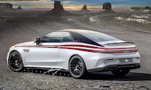
Detail of a 'kinetic design' Lincoln Town Car. This car was designed a few years ago. This rendering was to simulate the car at the clay model stage, ready for review. I'm already a bit tired of 'kinetic design,' lol. This could have been cutting edge for the marque 3 years ago. Click on each photo to enlarge and see in detail.

Mid-size AWD Lincoln MKE would replace Fusion-based MKZ.

All new, and I mean it, AWD compact Lincoln CrossStar 5 door hatch. The two rear doors would be 'access hatches' and would enlarge the opening to the rear seat, but only after the front doors were opened. They would be electronically opened activated by the keyfob, as would the rear hatch. No matter what the size of future Lincolns, they would be FILLED with electronics, full connectivity and luxurious materials.

A new Lincoln Mark coupe, based on the MKT crossover.

Ultra Lux Mark crossover coupe that goes in an ENTIRELY new direction. Chop based on the Aston Martin Lagonda concept.

I posted this chop with a shorter trunk a couple of weeks ago, but the longer version fits in with this category so well, here it is. A new full-length Town Car based on the MKT Ecoboost crossover.
From the Past: Slinkin' Lincoln

Old-School Kustom 1970 Continental, my Slinkin' Lincoln. Although one NEVER sees a 1970-71 Lincoln these days, with the exception of the Mark III, I've been in love with the clean lines of the this series since they were introduced. If they only had suicide rear doors they'd be PERFECT, lol. I chopped the roof, extended the grille, removed the B pillar, "fixed" the doors so they'd open properly, and cleaned up a bit of trim. If I was Chip Foose, I'd build this car NOW!
BTW:
A Little Bit About the Type on my Digital Pieces

Two words. Two fonts. Self-portrait, 2003, an homage to my earliest typographical memory.
One of my earliest memories of noticing typography was on my first piano teacher's VW Karmann-Ghia. I started taking lessons at age 5, after having been taught by my mother since I was two, and I can distinctly remember the "Karmann" being in Roman capitals, and the "Ghia" being more of a script font and angled slightly. I was fascinated that two words could use two different types. I started printing some words, and using cursive on others, although I had yet to learn the Palmer Method. Seven or eight years ago, I took a bunch of photos of my friend Sue's incredibly perfectly restored K-G to send to a car magazine in the UK (they used the photos too). This is a digital self-portrait I created from the photo of the trunk of her car, painted Porsche's Guards Red, in tribute to my first memories of the way typography can be used in creative ways.
I've been setting and using type professionally since 1981 when I started out at my local weekly newspaper company in the art/paste up department. Within 3 months I was the art director of 28 local weekly papers, 5 classified sections and a couple of pennysaver-type editions. Back in the Middle Ages of the early 1980s, we set type on a Compugraphic system which ran out the text in long sheets of paper, which we then manually sliced with scissors to fit on the pages. We had preset type sizes and premade font choices. I pushed the typesetters to the edge of the envelope and beyond in my quest for the "perfect" headline font or art page type treatment.
When I was promoted to New York, to Women's Wear Daily and the rest of the Fairchild Publications, the Macintosh was just coming into vogue. I became the technical art director in charge of installing these 'new fangled computers' in all of the art departments. I travelled extensively, going to all the new Apple shows. I became professionally acquainted with the QuarkXpress people, helping them 'beta' their emerging page program in real-world situations. I've been taught by the best typographers out there, putting up with their heinous personalities in many cases, lol, just to learn how to play with type effectively.
Fonts are one of my true loves in this digital world. I spend a lot of time on kerning, the inter-character spacing, on the letter forms, on the leading, (the space between lines) and every other aspect of the typed word. Sometimes I've found myself spending more time on the type than I did on the Photoshop portion of the rendering. I'm a bit upset with Blogspot's type controls—they're very rudimentary, nonintuitive and seemingly fairly random in execution. I'm not really able to control many aspects of the way the type appears on this blog, but I'm pushing it... As usual.
Re the slinkin' Lincoln: Frank Cannon wants his car back. And if you don't give it back, he'll sit on you.
ReplyDeleteI LOVE your chops. 'Specially the very first one in this blog. I'm an amateur aficienado of Lincoln esthetics, and this article really connects w/me. Interestingly enough, I remember the same connection with the Karmmann Ghia's chrome name plate. It seemed so 'different' though I do recall also that the 'VW' was masterful in and of itself (I still feel this way). So happy to make your acquaintance.
ReplyDeleteThanks, Bryce. Welcome here. This blog won't be updated as much as it was in the past year, but I'm starting a new one just for my car chops. I'll announce it here in a few weeks after I've put more into it. the url is:
ReplyDeletehttp://artandcolourcars.blogspot.com